Case Study: Montage
Framing an Effective Design System
Introduction
Setting The Stage
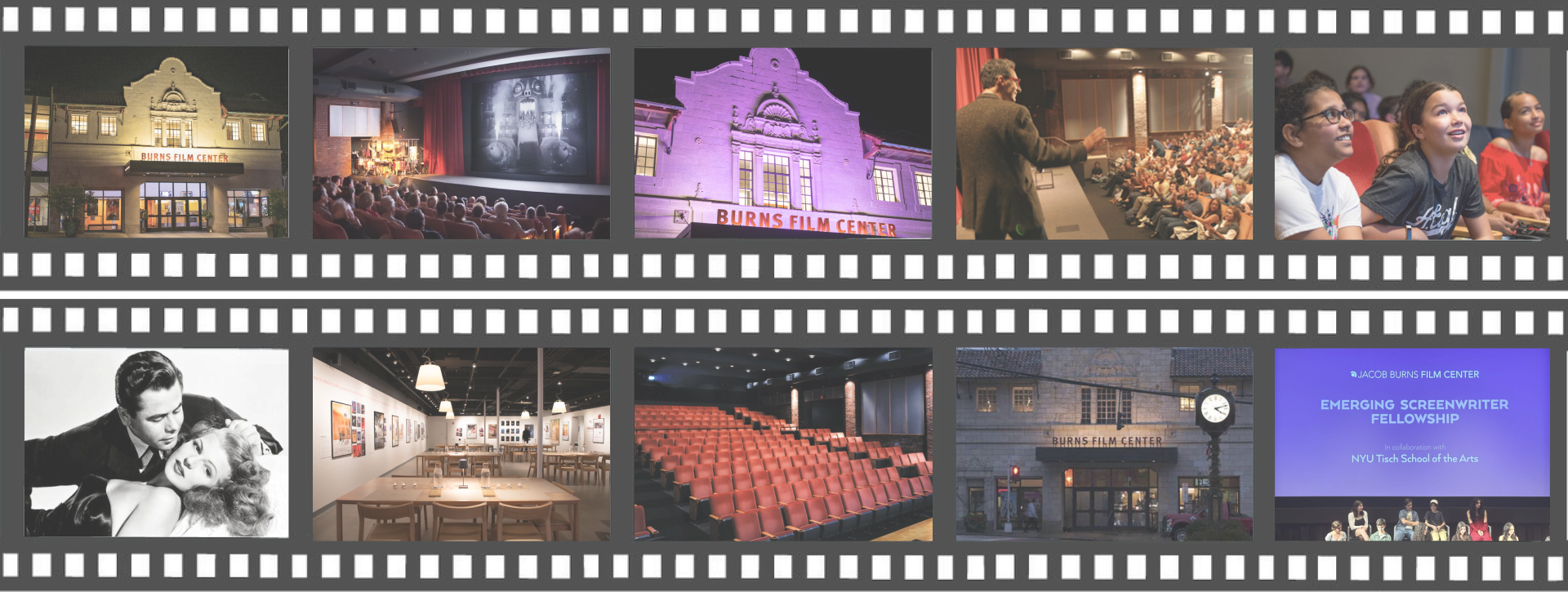
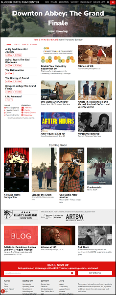
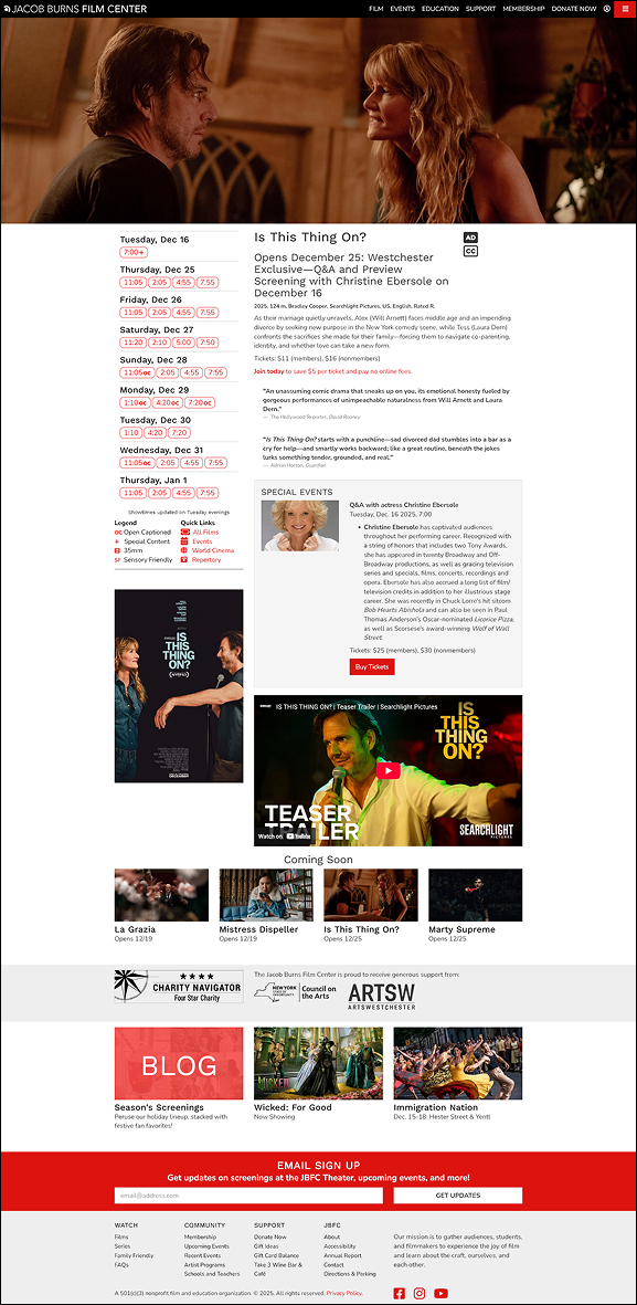
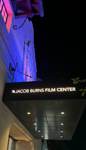
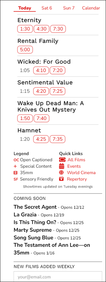
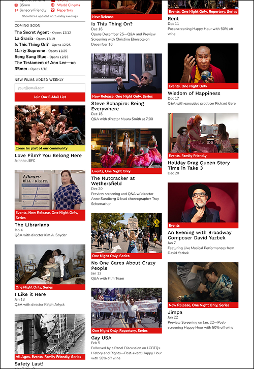
The Jacob Burns Film Center website is the digital hub for this nonprofit film center, supporting film promotion, education, memberships, and institutional storytelling. Over time, these needs have grown more quickly than the site’s structure, leading to drift in design patterns, dense layouts, and isolated design decisions.
The Montage Design System emerged as a response to these issues; our team - Team JAMMS - approached this project as a design systems challenge: we worked to create a shared design language and system that supports clarity, accessibility, and long-term growth.
This case study tells that story, with a particular focus on my individual contributions to the system’s visual foundations, including the icon system, color palette, and initial variable structure in Figma, alongside collaborative work on component design and documentation.


My Role
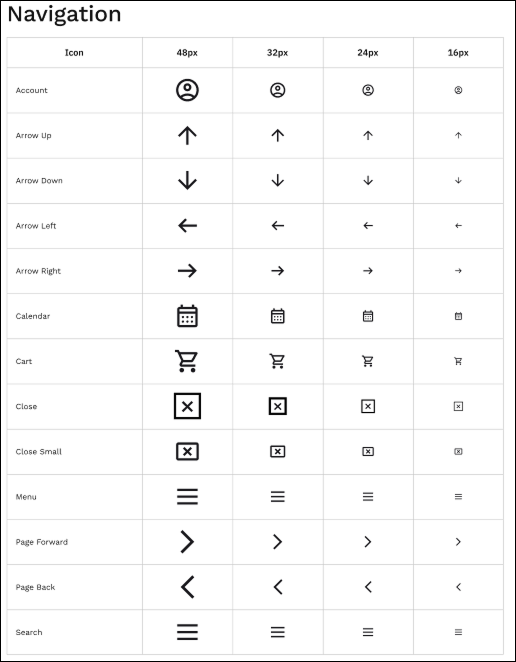
I served as a design-system lead within a collaborative team, with primary ownership of several core system areas. I individually designed and implemented the icon system, and I led the charge on creating a useable color palette by establishing the initial variable structure in Figma to support consistency and scalability.
In addition, I collaborated closely with teammates on synthesizing our findings, generating component designs, and creating documentation, helping translate system rules into reusable interface patterns and shared guidance.
Act I: The Problem
Arriving At The System As It Exists
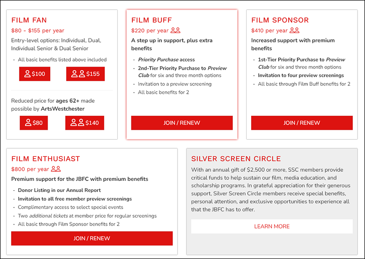
On initial site audit, the issues our team uncovered were frequent and scattered across the site. Navigation patterns vary slightly across pages. Tags are widely used but lack hierarchy. Typography and spacing shift, often compressing content. Together, these issues create frustration for users and difficult challenges for teams.
Without a design system, patterns are repeatedly reinvented, accessibility decisions are challenging, and visual drift accumulates as the site grows…
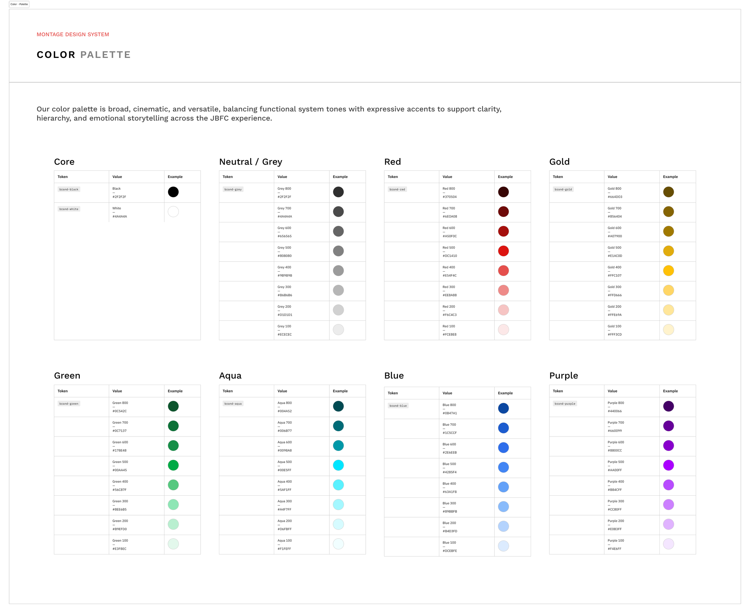
The Montage color palette is based on the JBFC branded crimson, but expanded and enhanced to allow for various semantic messaging indicators such as alerts, notifications and warnings - all while following WCAG 2.0 accessibility standards.
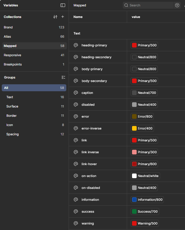
Variables & Tokens
Design tokens and variables operationalize design decisions, enabling consistency, scalability, and controlled change across the system.


Act II: Investigation
Understanding Patterns Beneath the Surface
The project began with a detailed site audit by our team. By cataloging components, navigation, and visual treatments, recurring patterns emerged. Similar problems were being solved repeatedly, but in slightly different ways, leading to inconsistency and rework. The system needs to function within a legacy WordPress environment as well as support editorial workflows.
This framed our challenge: the core issue was not necessarily visual quality, but the absence of shared rules…components without direction or uniformity, colors without semantic meaning, and accessibility applied unevenly if at all.
These findings directly informed our work on the system’s foundations, particularly the need for clearly defined color semantics, icon usage rules, and reusable tokens.
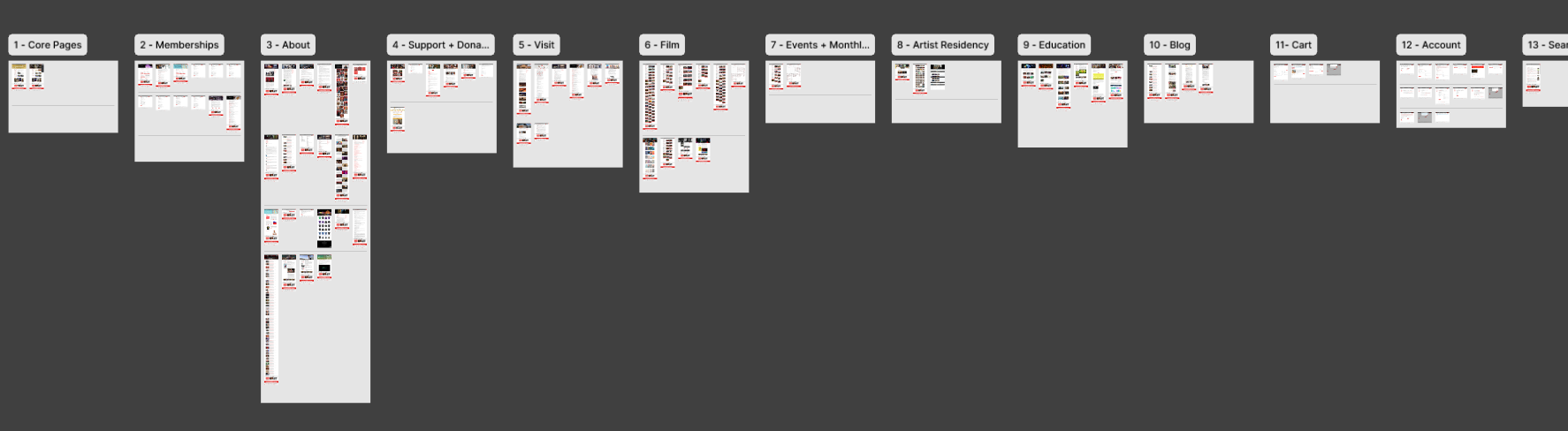
Conducting full audits of not only the different pages of the site, but the individual UI elements as well, allowed us to form a complete picture of the current state of all elements of the JBFC site.
Act III: Establishing the Rules
Designing the Foundations
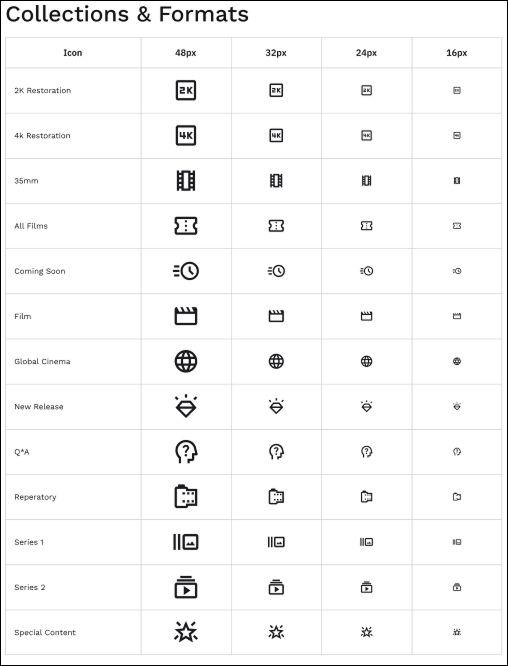
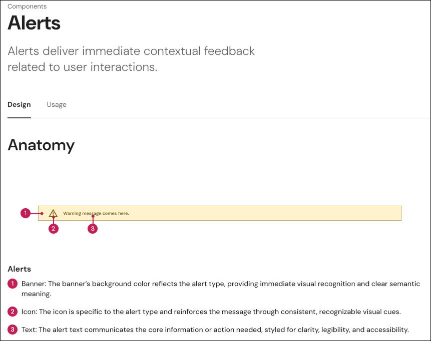
With the gaps identified, our attention shifted to foundations. With help from the team, I laid out the system’s color palette, structuring it from base colors to semantic roles to support consistent meaning across contexts. In parallel, I created the icon system, organizing icons into clear categories to reduce ambiguity and misuse.
To support implementation, I established the initial variable structure in Figma, translating visual decisions into reusable tokens that could scale across components and layouts.
Typography scales, layout principles, and additional foundational rules were developed collaboratively, building on these core elements. These foundations acted as constraints that simplified later decisions.
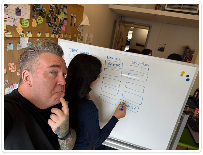
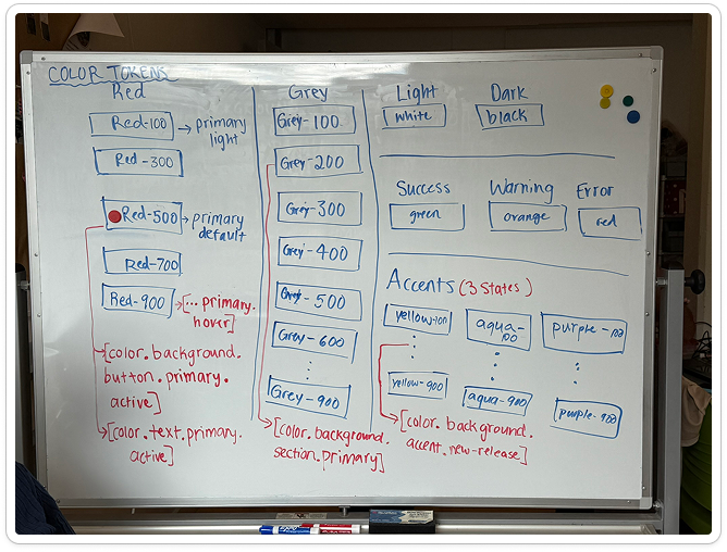
The team spent several working sessions coming to a shared understanding of our baseline token naming system, allowing me to later input the colors into Figma and generate semantic versions based on our core palette. Changes and adjustments were extremely easy after we locked our foundation.
Collaboration
Sustained cross-functional collaboration between designers, developers, and content experts is required to validate system rules, surface edge cases, and ensure successful adoption.
Act IV: Building the System
From Ground Rules to Interface Design
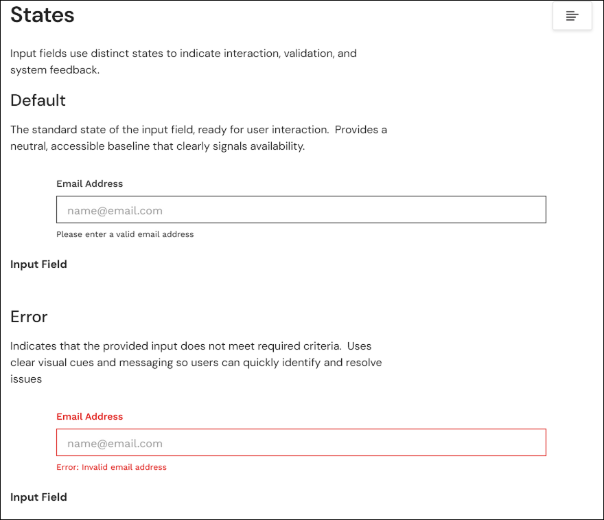
Component design focused on high-impact patterns such as media cards, input fields, alerts, navigation elements, and tags. This phase was highly collaborative, with components designed as small systems each with defined states, variants, and usage guidance. The team met regularly to review progress and improve on our work.
My foundational work on color, icons, and variables directly informed component behavior, ensuring accessibility considerations like contrast, focus states, and error handling were embedded by default rather than applied retroactively.
Tradeoffs balanced consistency with editorial flexibility, reinforcing the system’s pragmatic approach to reusability and uniformity.
Focusing on the Iconography system for Montage allowed me to learn all about Google Material Symbols which we adopted for our system, and also how to generate variants from single components so that designers had flexibility and convenience in their choices.
Act V: Creating a Usable System
Documentation as Design
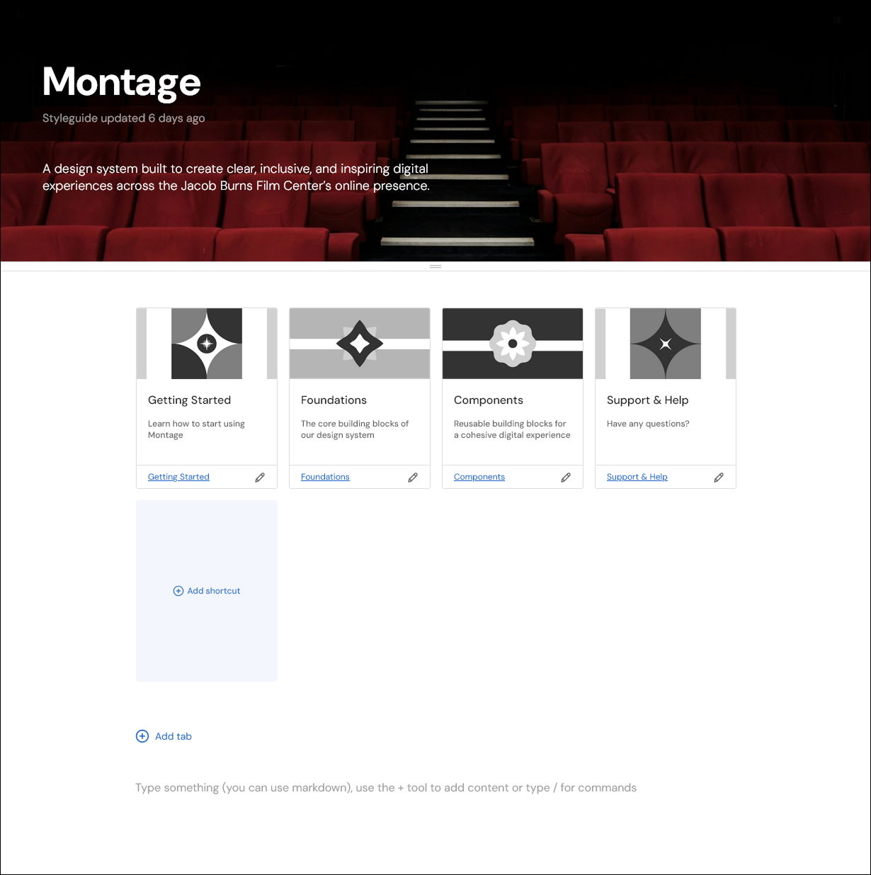
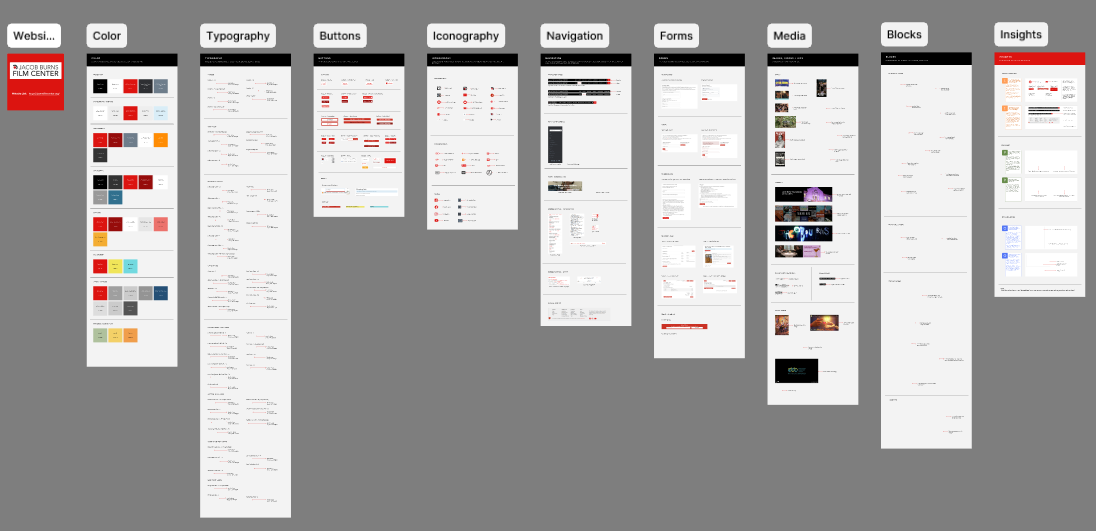
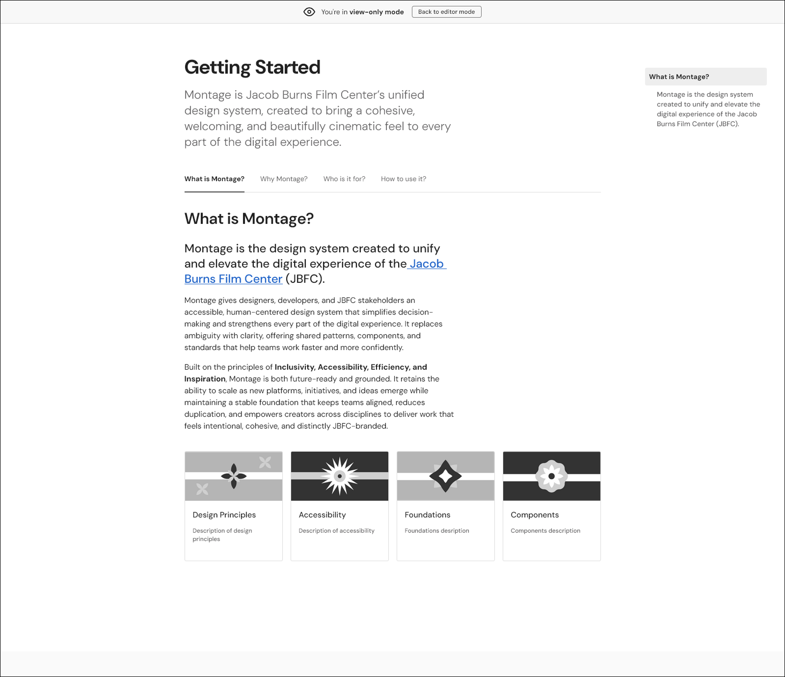
Montage was documented in Zeroheight with clear usage guidance and role-based structure. Documentation was developed collaboratively, but is informed by the same principles that shaped our system’s foundations: clarity, repeatability, and long-term maintainability. I concentrated on several sections, including the Getting Started chapter, iconography documentation, and color section. As a team, we shared the work of documenting all of the component sections.
Treating documentation as part of the system reinforces Montage as a living tool rather than a static deliverable, with the ability to flex and evolve over time as the needs of the JBFC change.
Act VI: Resolution
What Changed - And What’s Next?
We designed Montage to provide the Jacob Burns Film Center with a shared design language that improves consistency, accessibility, and efficiency. We feel that we’ve achieved our goals; systemized foundations, including the color palette, icon system, and variable structure, allow the site to evolve with greater confidence and efficiency. As a nonprofit center, I believe that a design system would tremendously improve the JBFC’s efforts in maintaining and enhancing their digital footprint while reducing costs and improving the visitor experience.
Potential next steps might hinge on formal adoption and setting up guidelines around system governance: measuring usage, refining contribution workflows, and deepening integration with development processes would all be valuable.
My Key Takeways
Color System
A semantically structured color palette reduces ambiguity, enforces accessibility constraints, and standardizes visual hierarchy across components.